Wild at HeartThe Jungle Books by Rudyard Kipling
Wild at Heart Homepage | Jungle Book Contents

Jungle Book Cover Art:
1 | 2 | 3 | 4 | 5 | 6 | 7 | 8 | 9 | 10 | 11 | 12


WHAT’S WRONG WITH THIS PICTURE?
Updated August 2019
Most of the images link to bigger versions
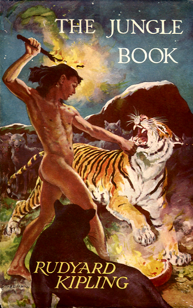
Jungle Book cover - Mowgli attacking Shere Khan by Stuart Tresilian 

Stuart Tresilian’s cover for the “Young Persons’ Edition” of The Jungle Book depicts the iconic moment from Mowgli’s Brothers when Mowgli, naked and unprotected, attacks the tiger Shere Khan with a blazing branch. This is certainly one of the most striking covers ever drawn for The Jungle Book, but the more I look at it the more it seems to me that there’s something a bit odd about it...

Just take a look at Mowgli’s right arm. Isn’t it rather strange that he should be holding the burning branch behind his head with his arm twisted around like that?

And then there’s his left arm, which he’s had to twist through 180 degrees in order to grab Shere Khan by the chin.

And to get is arms into these positions he’s had to turn his upper body at right angles to his legs.

Now admittedly if you were trying to keep hold of a struggling tiger you might get into some contorted positions, but in terms of artistic composition Mowgli’s pose does strike me as very peculiar.

It just so happens that there is an earlier Tresilian painting which might shed some light on this puzzle...


This is a colour plate from All the Mowgli Stories, and as you can see it depicts the same scene with a few compositional differences.

Mowgli is standing straight, facing Shere Khan with his back to the viewer. He is holding the tiger with his left hand and the branch in his right. His pose appears much more natural than in the other version of the scene.

All of the other elements of the scene are almost identical, from the staring wolves in the background to the firepot on the ground, except that they are mirror images of the other scene - note that the poses of the two cats are reversed.

The reversal was probably an editorial decision to do with the placement of the text. But why are the two versions of Mowgli’s pose so different?

Well, I have a sneaking suspicion that they weren’t meant to be - in other words, that the picture was changed before publication....

 All the Mowgli Stories colour plate  - another view of Mowgli attacking Shere Khan by Stuart Tresilian

Let’s assume that when Tresilian’s publisher asked for a Jungle Book cover he obliged with a scene based on the earlier Mowgli Stories plate. But there was a problem. The publisher didn’t like it and asked for a last-minute revision. There was no time to paint a new cover, so as a compromise Tresilian had to alter Mowgli’s pose.

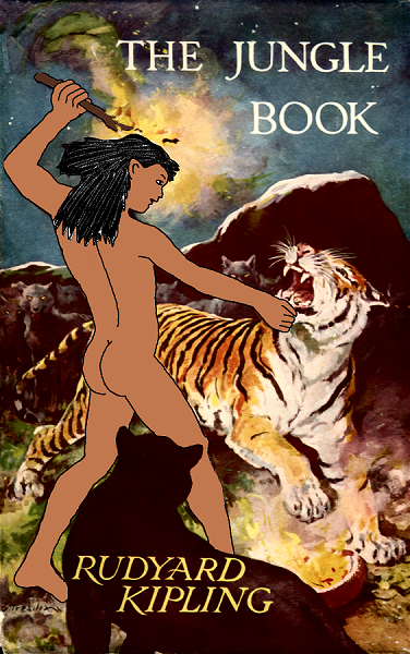
So why did the publisher ask for a revision? Well, by superimposing my own sketch of what I think Mowgli’s pose must have originally looked like (please try to forgive my lousy drawing!) I’ve come up with how I imagine Tresilian’s original submission might have appeared....


Variation on Jungle Book cover - Mowgli attacking Shere Khan by Stuart Tresilian as he might have originally appeared 

In this version Mowgli’s pose almost exactly mirrors the earlier plate - except that he’s holding the burning branch in a different position. All of the other elements of the scene are also exact mirror images, right down to the position of the rocks in the background.

So what possible objection could the publisher have to this picture? Well, the most obvious problem is the nudity.

It wouldn’t be the first time Mowgli had appeared nude on a book cover - Tresilian painted him naked for the dustjacket of the same edition of All the Mowgli Stories. But in the new painting Mowgli occupied more of the frame and his naked back and bottom were more prominent. It’s quite possible that the publisher was worried about potential accusations of indecency, and asked Tresilian to change the picture.

Presumably there was no time to redo the picture completely, and rather than simply cover up the nudity with a loincloth Tresilian was forced to compromise by altering Mowgli’s pose within his original silhouette, so that his buttocks only appeared in profile.

This meant rotating his torso to show his chest rather than his back, and swapping his left and right arms, even though that placed them in awkwardly twisted positions. This did however have the side effect that Mowgli once more appeared to be holding the branch in his right hand, however uncomfortably.

It’s a pity the original composition wasn’t used. It’s also a pity that I can’t draw well, otherwise I’d reproduce the original design properly.

Of course, if there’s anyone out there with the skill and the inclination to do so, please feel free!


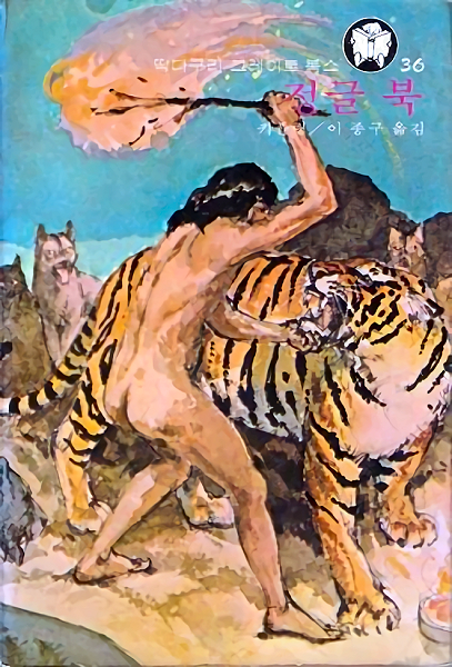
Variation on Jungle Book cover - Mowgli attacking Shere Khan by an unknown Korean artist loosely based on Stuart Tresilian's version 

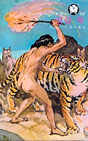
And that’s not all...! In August of 2009, Marc sent me a link to a South Korean edition of The Jungle Book whose cover was obviously based on the Tresilian version. All of the elements from the original picture are there - the nude Mowgli, Shere Khan, Bagheera, the wolves, the rocks, the blazing branch and the fire-pot on the ground.

Now, interestingly enough, the Korean artist has also recognised the problem with the Tresilian cover and has come up with a very simple solution. By turning Mowgli’s shoulders around so his back is no longer twisted, and getting him to crouch down a bit so his face is closer to Shere Khan’s, the artist is able to show Mowgli in a three-quarter right view that appears much more natural. He’s still holding Shere Khan with his left hand and brandishing the flaming branch in the right, and what’s more, he’s closer to Shere Khan - no longer at arm’s length - which makes him seem even braver (or more foolhardy).

Obviously the Korean publisher had no qualms about displaying his nude back (you’ll also notice that the artist has even shifted Bagheera almost out of frame so that Mowgli’s lower legs are also visible).

Unfortunately Mowgli’s right arm, holding the branch, now obscures his face. Apart from that, my only complaint is that the artist couldn’t draw better!


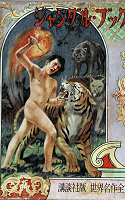
Variation on Jungle Book cover 2 - Mowgli attacking Shere Khan by an unknown Japanese artist loosely based on Stuart Tresilian's version 

Later I discovered this cover from a Japanese edition. There are some compositional differences, but it’s also clearly based on Tresilian’s cover.

Once again it’s interesting to see how the artist has attempted to solve the problem of Mowgli’s pose. This time the artist has chosen to turn his head and hips around to the right so his posture isn’t as twisted, and we only see his naked buttock in a three-quarter front view.

It’s also a more dynamic pose, with Mowgli leaning in toward Shere Khan, and getting even closer than in the Korean version - forearm’s length, rather than a full arm’s length as depicted by Tresilian. As in the Tresilian version, however he’s still holding the branch awkwardly over his shoulder, and looks to be in danger of singeing his hair!

If anyone happens to know where I might obtain better quality images of the Korean and Japanese covers, please let me know. I’ve replaced the original version of the Japanese cover with a better one, but it's still not completely sharp.


thumbnail - original versionanimated thumbnail - comparisonthumbnail - revised versionthumbnail - Korean versionthumbnail - Japanese version
The Kipling Society
The Kipling Society
Wild at Heart banner
Wild at Heart homepage
 
Return to Top of Page