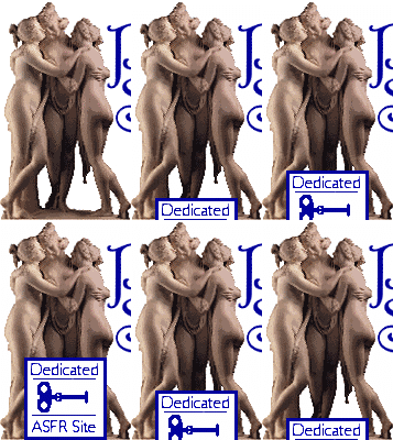
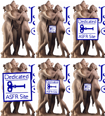
          |  Introduction | Female Stories | Male Stories What’s New? | FAQ | Links | Art Gallery Pygmalion Group | Blogmalion | E-mail me By absolutely no public demand, here are some of my favourite logos from the past 5 years....  One of the earliest designs, flanked by two versions of Pygmalion and Galatea by Jean Léon Gérôme. Not a pictorial logo - the lettering was originally positioned using HTML.  The first logo to use Harrington font. Quite stylish, I feel, especially with the subtle use of shadows, but maybe a bit too dark.  This is where I started using dark letters on transparent backgrounds, and inventing amusing(?) slogans for the front page logos.  Introducing Canova’s Three Graces, who’ve been on the logo ever since. You may have noticed that the Pygmalion Syndrome logo wasn’t a solid block - the words were repositioned each time I changed the size of the logo.  For the Queen’s Jubilee and soccer World Cup in 2002 I referenced Never Mind the Bollocks by the Sex Pistols, and wrapped the girls in the flag. The flag was hand-drawn by me, and is accurate to the extent of having both broad and narrow white stripes in the diagonals. The only mistake I made was putting them back to front - with the “flagpole” side on the right instead of the left.
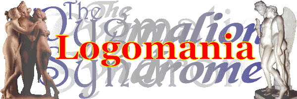
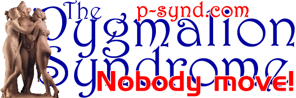 Another page redesign gave me more space for the logo, and a new server gave me my own domain name for the first time as well as lots more file space. This logo also has one of the simplest and most effective slogans I ever came up with. 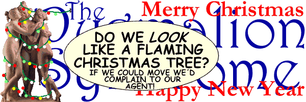 Christmas 2003. At my trial for intolerable cruelty to statues I was acquitted on the grounds of insanity. I always knew my insanity would come in handy one day. 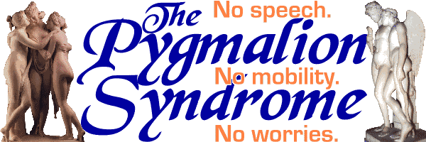 The first major logo redesign for years retains the Three Graces, adds a statue of Cupid and Hymen by George Rennie from the Victoria and Albert Museum to indicate that male statues are also catered for, and changes the main lettering to Black Magic font. 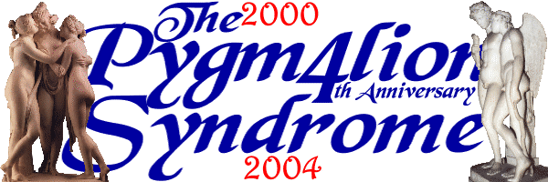 The next version of the logo stretches the lettering horizontally so that the statues on either side overlap with it. For the 4th Anniversary logo, I incorporated the years in Harrington font as a tribute to the old design. I also discovered that once I’d replaced the a of Pygmalion with a 4 the word Anniversary fitted in very neatly. A nice bit of serendipity. 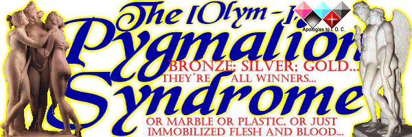 Then I came up with the idea of adding a yellow glow effect to the lettering and figures. This proved a bit more complicated than I originally thought, but it worked. To celebrate the Athens Olympics in August 2004, I came up with my own version of the Olympic logo, using Argo Forg’s freeze-type diamonds instead of rings. Although the result was a bit cluttered I quite liked it... 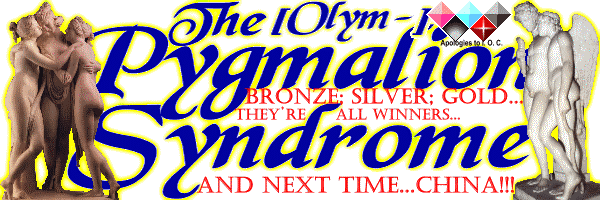 ...and then just as the Games were finishing I had a sudden flash of inspiration based on the fact that the 2008 Games were scheduled to be held in Beijing! 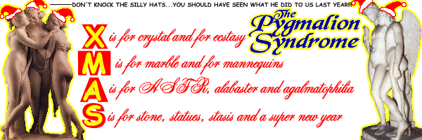 Christmas 2004: Last year it was fairy lights, this year it's Santa hats. And next year? Well, I’ll have to see if I can rustle up some reindeer antlers. Though as to just where I’m going to put them......!!! 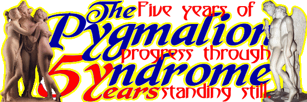 Sometimes I amaze myself with my own ingeniuity. Once I’d changed the S in Syndrome to a 5 for the 5th Anniversary logo, I realised that I could use the adjacent y as the first letter of the word years, since the tail of the y dropped down and there was space for the rest of the word behind it. And did anyone congratulate me on my creative brilliance? Did they heck.... I suppose the slogan Five years of progress through standing still could be seen as slightly redundant, but I was in party mood. |
